First Drawings
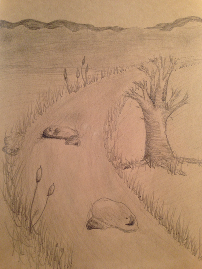
This was the first drawing we did in class, it's just a simple drawing of a tree and a river. I probably could've done better but I'm happy with how the tree turned out.
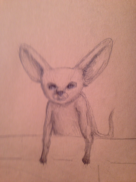
Our second drawing was of any animal we wanted. I drew a desert rat, I really struggle drawing animals so I'm excited to learn how to properly draw this later.
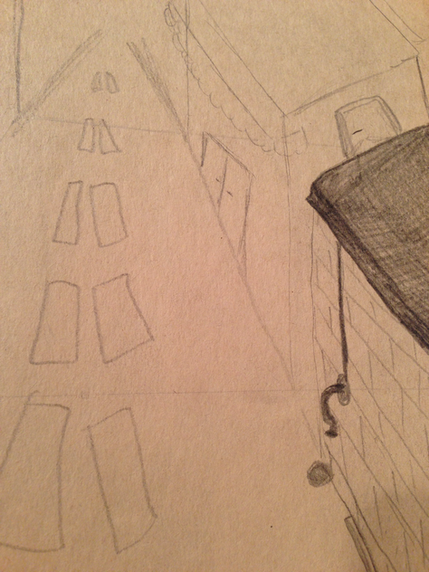
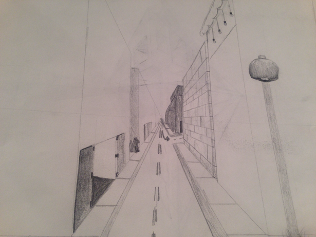
We then drew a street scene, I remembered what we learned last year, on point perspective. However I forgot how to use the point so this is how it turned out. We will freshen up on this technique later
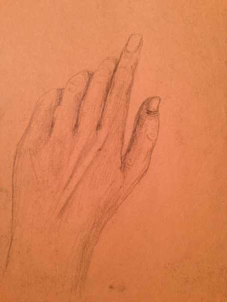
This was the last of the four first drawing to test our skill, in not brilliant and really any human body part. But this hand didn't turn out to bad.
Point Perspective
My first perspective drawing was a one point perspective drawing of a city.
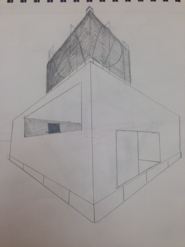
This is my attempt at two point perspective.
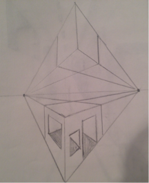
Our final perspective drawing was a three point drawing, by far the hardest one to do, but it was really interesting to see come together.
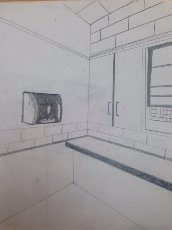
Our last project in perspective was to draw a corner of the room. We did this using point perspective, I ended up only needing two points to achieve this.
Pencil Still Life
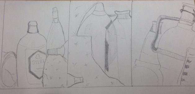
We started this project practicing different ways to draw the bottles we saw. These are my compositional sketches for my final project. I ended up going with the one on the far left.
1)Describe how you arranged you composition. Discuss your use of the elements and principles. Is it a successful composition?
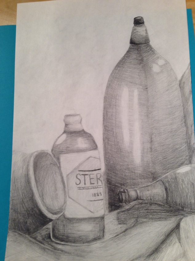
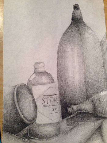
In my composition, a goal of mine was to make the arrangement of the bottles appealing to the eye, and because we all had to do four bottles, I had them placed in a specific way. Making them seperated by shadows and depth. I did struggle with texture, and in the end I don't feel that I was able to get all of the different bottles to appear to be different kinds of glass.
In my composition, a goal of mine was to make the arrangement of the bottles appealing to the eye, and because we all had to do four bottles, I had them placed in a specific way. Making them seperated by shadows and depth. I did struggle with texture, and in the end I don't feel that I was able to get all of the different bottles to appear to be different kinds of glass.
2)Did you use a wide range of values? (A range from white to black with at least 9 values.) Explain how this is evident?
I think in this still life I was able to achieve about 7-8 different values. This is incredibly important to create realistic and believable shadows.
I think in this still life I was able to achieve about 7-8 different values. This is incredibly important to create realistic and believable shadows.
3)Explain how your knowledge and creating practice studies with value contributed to your piece.
My pre-existing knowledge of these techniques helped me to shade with the "grain" of the objects in my still life.
My pre-existing knowledge of these techniques helped me to shade with the "grain" of the objects in my still life.
4) Describe the blending and transitions in your objects (discuss your use of pressure with pencil and other techniques to achieve this).
Previously I'd use a smudge stick to get the blended quality I wanted. But I learned how to gradually apply less pressure to achieve a fluid transition in values.
Previously I'd use a smudge stick to get the blended quality I wanted. But I learned how to gradually apply less pressure to achieve a fluid transition in values.
5) Explain how your interpretation of texture is essential in capturing the look of the object.
Because this still life was of glass bottles, and pottery, we had to know to create these textures. My interpretation of these textures was presented in the highlights, because I noticed that in the bottles there are very prominent spheres of white light on the bottles.
Because this still life was of glass bottles, and pottery, we had to know to create these textures. My interpretation of these textures was presented in the highlights, because I noticed that in the bottles there are very prominent spheres of white light on the bottles.
6) If you could recreate your pieces what would you do differently to enhance the final outcome?
Id probably work on getting more values, and making the pencil strokes more fluid, so you couldn't see the lines. I'd also work on keeping consistent shadows in relation to the implied source of light.
Id probably work on getting more values, and making the pencil strokes more fluid, so you couldn't see the lines. I'd also work on keeping consistent shadows in relation to the implied source of light.
Pen and Ink
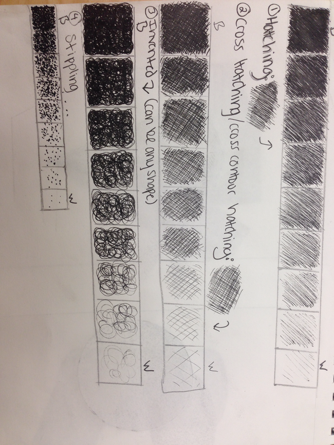
The first thing we did with pen and ink was the techniques you use, the one on top is called hatching. Hatching is just straight lines in different densities to create shadows. The one below is crosshatching which is hatching and then perpendicular lines hatching across it. Then inventive, this one you can make up but it has to be consistent. The last, is stippling which is a tedious process of small dots.
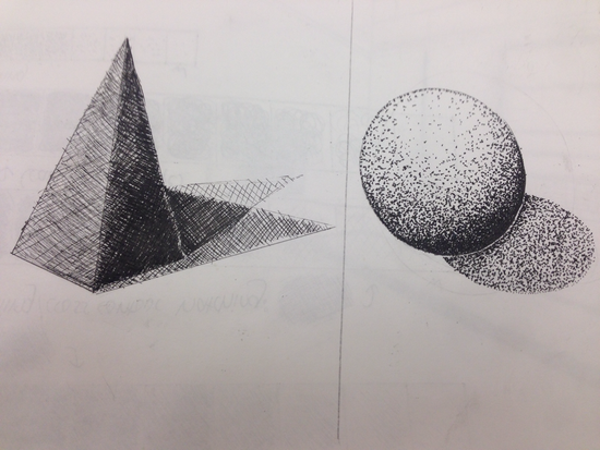
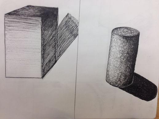
We then practiced these techniques in 3-d shapes. I used hatching for the rectangular prism. My cylinder was done using inventive and I chose to do swirls. My sphere is stippling which I thought had a really great effect in the end. And finally for my triangular prism I did crosshatching.
Pen and Ink final
1) Discuss your descision on pen and ink techniques. Why you chose to use or more.
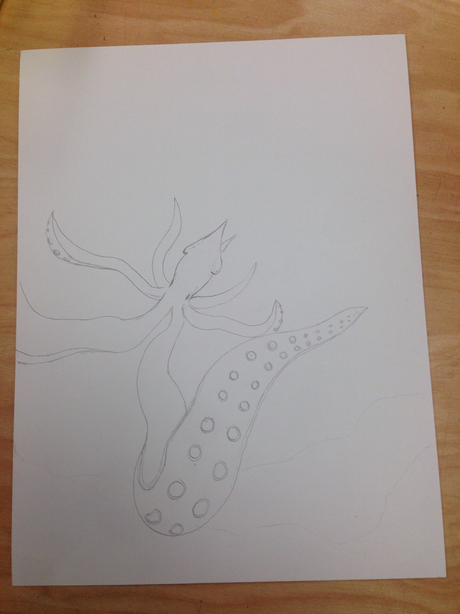
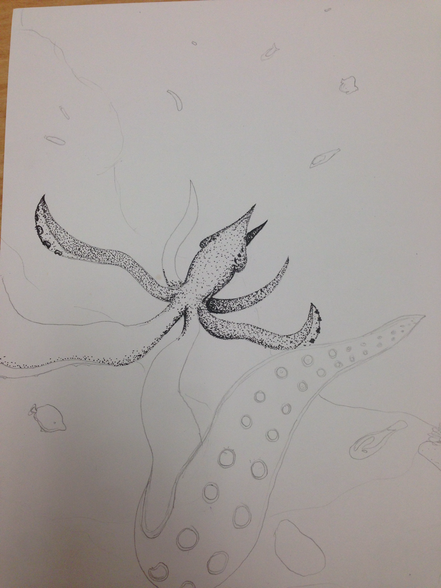
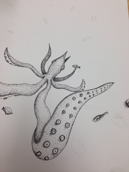
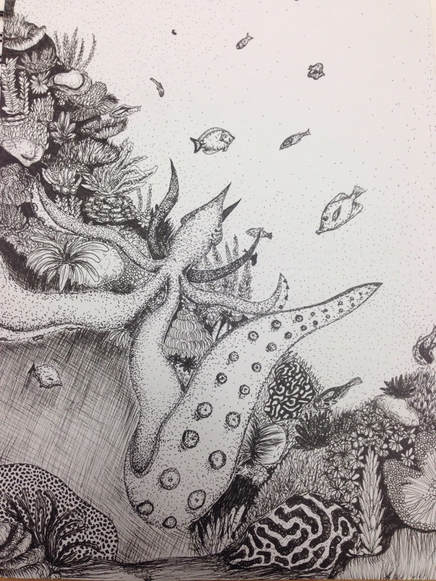
I used a lot of different techniques on my pen and ink, including stippling on my squid and some of the fish. Most of my coral is inventive. I chose these techniques because I thought these techniques would be best for the texture of the sea.
I used a lot of different techniques on my pen and ink, including stippling on my squid and some of the fish. Most of my coral is inventive. I chose these techniques because I thought these techniques would be best for the texture of the sea.
2) How did you use perspective? Why is perspective important?
Perspective was represented in my squids tentacles by making it look closer that the rest of the squid to the viewer. Perspective is important because it gives a new realism to your drawing.
Perspective was represented in my squids tentacles by making it look closer that the rest of the squid to the viewer. Perspective is important because it gives a new realism to your drawing.
3) How is texture important in your composition?
The coral and and squid in real life have very different textures so using different penning techniques and ranges of values was a priority in my piece.
The coral and and squid in real life have very different textures so using different penning techniques and ranges of values was a priority in my piece.
4) Why is value so important in this project?
Because of the material used to creat this, it is very easy to make the piece look flat and dimensionless, so adding value makes it look much more realistic and believable.
Because of the material used to creat this, it is very easy to make the piece look flat and dimensionless, so adding value makes it look much more realistic and believable.
5) Describe your craftsmanship (How well the project is crafted technically)
I did several layers of pencil to figure out placement of everything before pen, I then lightly went in with basic outlines of the larger things in my piece. The rest was just crafted with trial and error of penning and more penning.
I did several layers of pencil to figure out placement of everything before pen, I then lightly went in with basic outlines of the larger things in my piece. The rest was just crafted with trial and error of penning and more penning.
6) If you could recreate your piece what would you do differently to enhance your final outcome?
I for the most part liked my piece in the end, but I think I would have added a bit more shading to the base of the largest tentacle.
I for the most part liked my piece in the end, but I think I would have added a bit more shading to the base of the largest tentacle.
8) When applying the pen and ink techniques why and how is it important to make sure you understand the concepts taught in class?
I looked back at my value charts to make sure I was applying the correct techniques during my entire piece and I think I applied them well.
I looked back at my value charts to make sure I was applying the correct techniques during my entire piece and I think I applied them well.
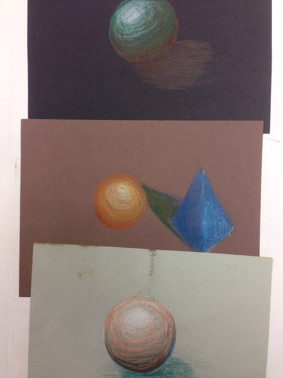
Pastels
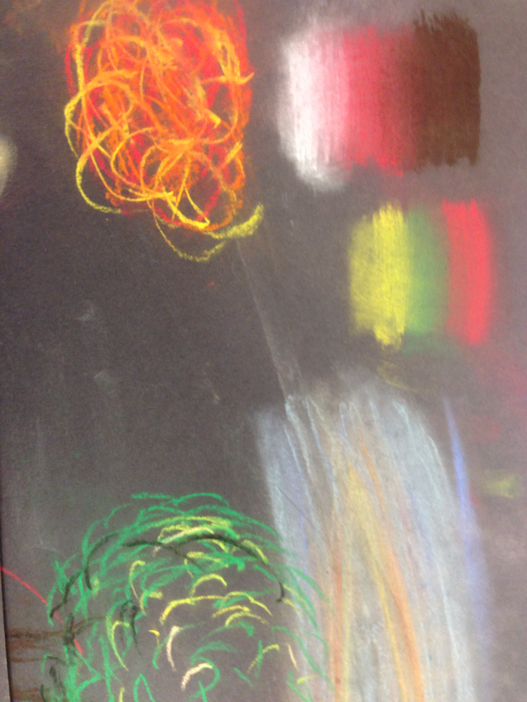
This is the start of us learning pastels, just trying techniques and different values with the new medium.
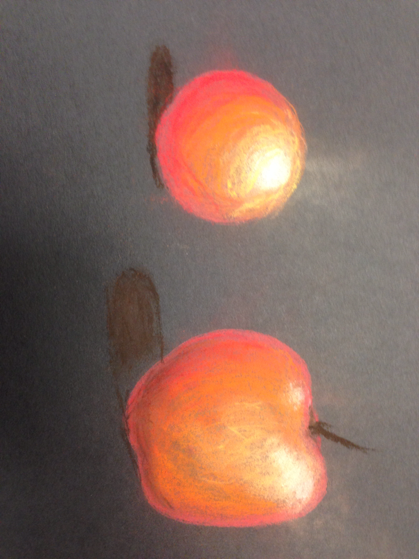
This is my take on an apple with the pastels, trying out values and shading with pastels, as well as a sphere that I practiced with.
Prisma-Colors
These are my forms for prisma colors, I really liked the softness of the lead as opposed to normal crayola colored pencils.
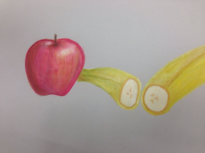
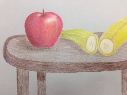
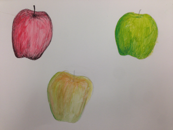
For this project we were told to do two fruit with the pencils and I really like building up the lead to create smooth texture on the apple. I think it turned out okay but the table was really last minute and it's pretty obvious.
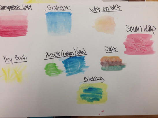
We then started practicing different kinds of watercolor, the salt and Saran Wrap help create different textures.
These are my forms and value chart for watercolor.
We then added prismas and pen to watercolor apples to try the different mediums together, which had a really cool effect.
Prismas/Watercolor/pastels Final
1) Describe the craftsmanship of your drawing(is it neat and well executed)?
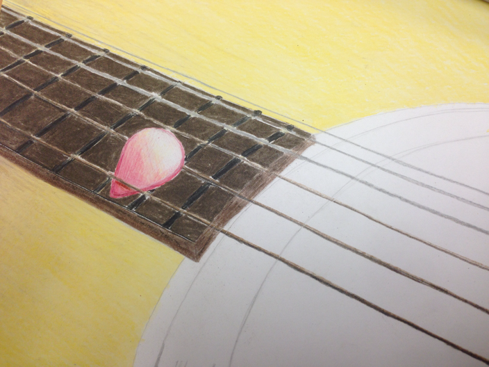
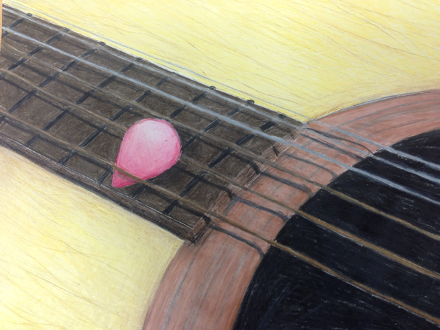
I believe I did I good job blending the guitar so it has a more realistic look and texture. Overall my craftsmanship was well executed.
I believe I did I good job blending the guitar so it has a more realistic look and texture. Overall my craftsmanship was well executed.
2) Do you think you used a full range of values to create a sense of depth?
I think if I were to do this again I would have added more shading, but the strings have a good cast shadow so I think that looked pretty good.
I think if I were to do this again I would have added more shading, but the strings have a good cast shadow so I think that looked pretty good.
3) How do you think you represented the style of the artist Georgia O' keef?
My guitar wasn't so close that it became abstracted. It is still recognizable but to the degree that I wanted, so it's more my take on her style of art.
My guitar wasn't so close that it became abstracted. It is still recognizable but to the degree that I wanted, so it's more my take on her style of art.
4) Describe your choice of colors/color harmonies and how you used them throughout your artwork.
The different earthy colors, nudes, and browns had a very warm monochrome vibe that I thought looked really good together.
The different earthy colors, nudes, and browns had a very warm monochrome vibe that I thought looked really good together.
5) How did you create contrast in your drawing?
I didn't have a wide range of colors because of the wooden structure of the guitar. But the yellow has a really
I didn't have a wide range of colors because of the wooden structure of the guitar. But the yellow has a really
6) How did you use textures, highlights, and shadows to enhance your artwork?
The cast shadows of the strings and the way I placed the pick under the strings made then appear as though they were popping off of the part, and my use of brighter colors around the frets brought them to life as well.
The cast shadows of the strings and the way I placed the pick under the strings made then appear as though they were popping off of the part, and my use of brighter colors around the frets brought them to life as well.
7)Describe any difficulties you had creating your drawing and what could you do to improve your drawing?
A difficulty I had creating this drawing was the shading in the yellow part of the guitar, it ended up looking like a background rather than part of the guitar. To fix it I could probably put more texture like wood patterns or something.
A difficulty I had creating this drawing was the shading in the yellow part of the guitar, it ended up looking like a background rather than part of the guitar. To fix it I could probably put more texture like wood patterns or something.
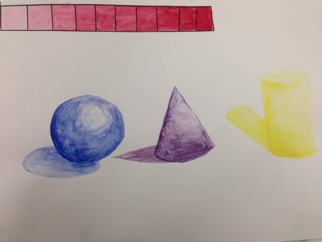
Acryllic Paint
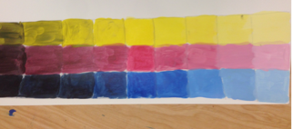
Starting with paint: these are the value charts, I just did primary colors to try value. (Red, blue, yellow)
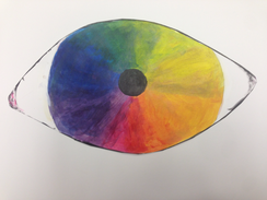
The next practice with the paints was the color wheel, I decided to do an eye, including the primary, secondary, and tertiary colors in the color wheel.
