Drawing
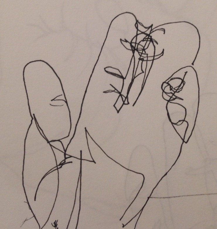
Here is my blind contour hand drawing in pen.
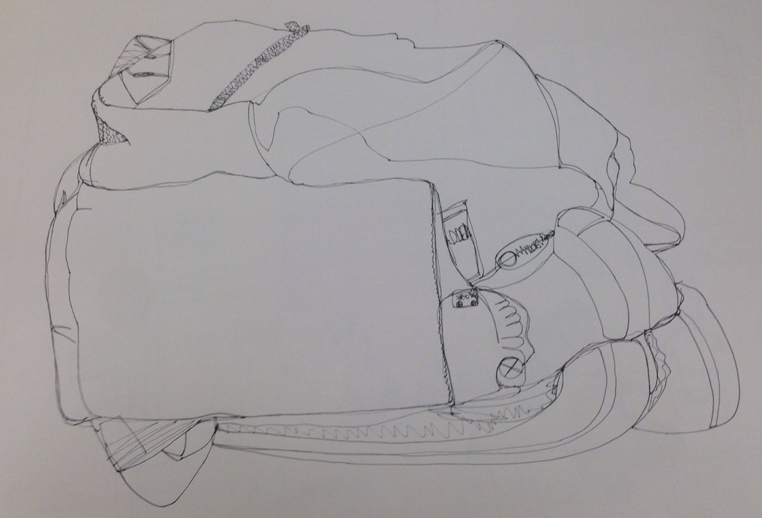
This is my first contour line drawing, I drew my backpack and looked as little as I could.
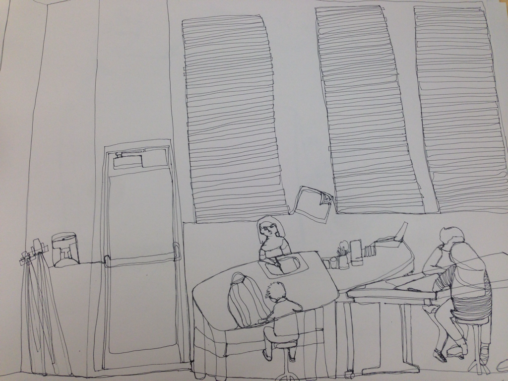
This is my first room contour line drawing.
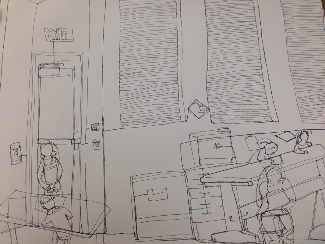
Contour room drawing Final
1) Did you use a fluid line? Explain how this is evident.
Yes I used a fluid line, you can see this because there is no seperation between objects, and every line is a part of the entire picture.
Yes I used a fluid line, you can see this because there is no seperation between objects, and every line is a part of the entire picture.
2) Explain how your knowledge and creating practice studies with contour line contributed to the success of your piece.
Because of my former practice to this project, I was able to create a whole picture with a background and people without leaving the paper. Had I not had this practice, you may not have been able to tell what I attempted to contour.
Because of my former practice to this project, I was able to create a whole picture with a background and people without leaving the paper. Had I not had this practice, you may not have been able to tell what I attempted to contour.
3) Describe the difference in your contour line drawing to an outline drawing.
The contour drawing includes not separating pen from paper until the piece is complete, while outline drawings are just the edge the of the pictures you see, but the pen can start multiple lines and leave the paper.
The contour drawing includes not separating pen from paper until the piece is complete, while outline drawings are just the edge the of the pictures you see, but the pen can start multiple lines and leave the paper.
4) Explain how your interpretation of line is essential in capturing the look of the room.
Knowing where you are and aren't seeing lines is essential to creating a convincing drawing.
Knowing where you are and aren't seeing lines is essential to creating a convincing drawing.
5) What did you learn from completing this drawing? If you could recreate your piece what would you do differently to enhance the final outcome?
Doing this project, I learned how to be more analytical of my surroundings to create a better picture. If I were to do this project again I would most likely start the drawing from the foreground, I think this would make it easier for me to create more identifiable shapes.
Doing this project, I learned how to be more analytical of my surroundings to create a better picture. If I were to do this project again I would most likely start the drawing from the foreground, I think this would make it easier for me to create more identifiable shapes.
Shading practice
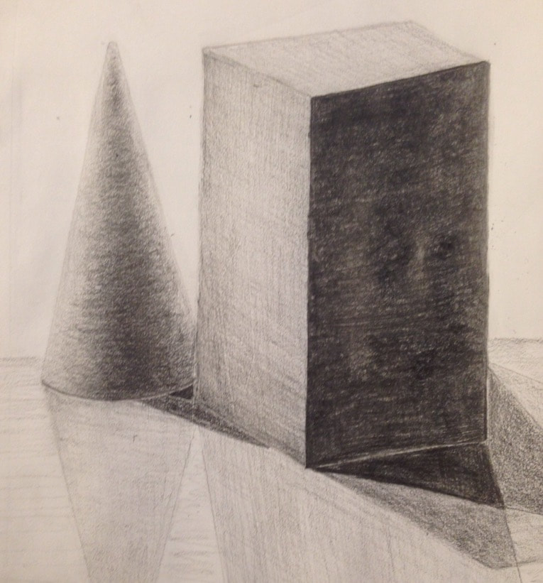
This is a form drawing I did using a standard drawing pencil, I practiced shading on a curve with the cone, and more straightforward shading on the rectangular prism.
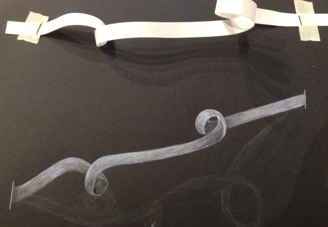
In this picture I sketched this paper ribbon, shading opposite to the norm with whit pencil on black paper.
Fabric Unit
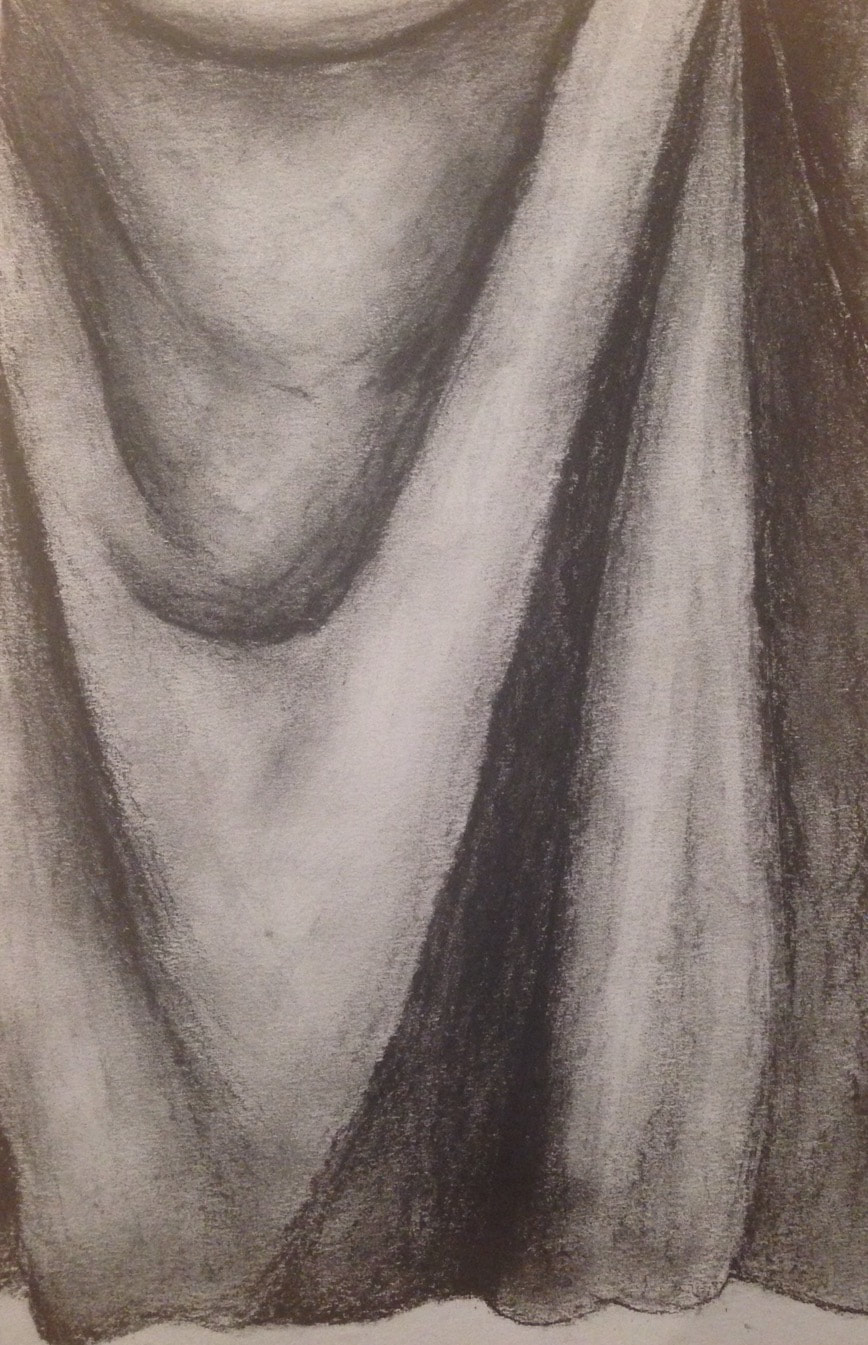
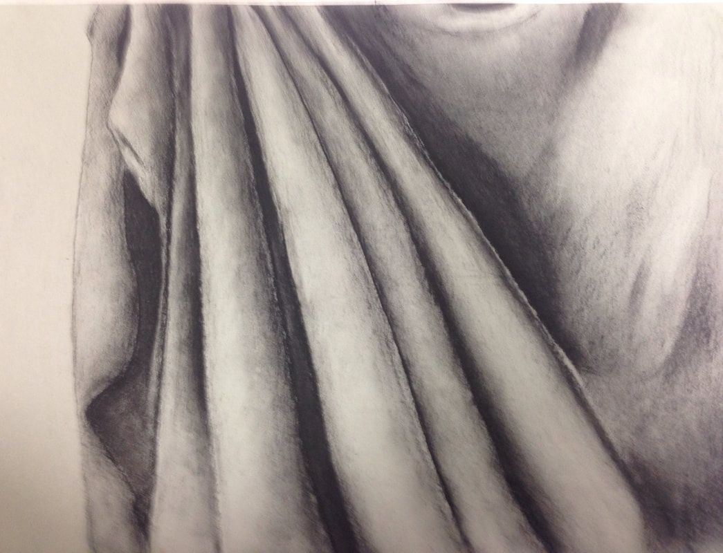
For my first fabric drawing I shaded with black charcoal on grey paper.
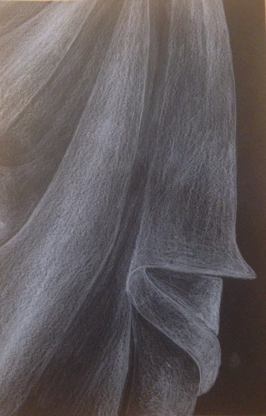
For my second fabric drawing, I shaded with white prismas on black paper.
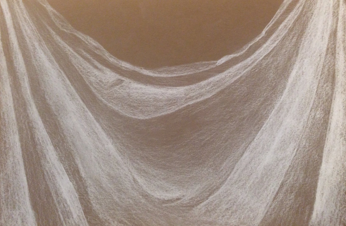
For my last fabric drawing I used white charcoal on brown paper.
Fabric Final
1) Did you use a wide range of values? (A range from white to black with at least 9 values). Explain how this is evident?
My range of values was my favorite part about this piece, my shadows were exaggerated but very dark, and my highlights were clear. This is evident because none of the ripples in fabric are "melded" together and each wrinkle is easy to indentify due to the crisp lines and differenciation in value.
My range of values was my favorite part about this piece, my shadows were exaggerated but very dark, and my highlights were clear. This is evident because none of the ripples in fabric are "melded" together and each wrinkle is easy to indentify due to the crisp lines and differenciation in value.
2)Explain how your knowledge and creating practice studies with value contributed to your piece.
Had I not had the practice with different shading, firstly I wouldn't know the the medium I chose is my strong suit. But I also wouldn't know how to create the crispness between the folds, which made my final really convincing.
Had I not had the practice with different shading, firstly I wouldn't know the the medium I chose is my strong suit. But I also wouldn't know how to create the crispness between the folds, which made my final really convincing.
3) Describe the blending and transitions in your fabric (discuss your use of pressure with pencil/colored pencil/charcoal pencil and other techniques to achieve this).
Because I used black charcoal, I had to go in very lightly with the lead to get the light values, but applying the right amount of pressure can create really great shadows which is why I chose this medium. In terms of blending I used slightly dampened paper towels sweeping the darker values towards the highlights to create a vague appearance of an ombrè.
Because I used black charcoal, I had to go in very lightly with the lead to get the light values, but applying the right amount of pressure can create really great shadows which is why I chose this medium. In terms of blending I used slightly dampened paper towels sweeping the darker values towards the highlights to create a vague appearance of an ombrè.
4)Explain how your interpretation of texture is essential in capturing the look of the object.
Because this drawing is of fabric, a matte and soft texture, I had to account for that when shading and highlighting. If you highlight sharply and in abrupt patterns, the fabric can look shiny which in this case isn't ideal. And with shadows, making sure the folds were obvious convinces someone seeing it for the first time that this is really fabric and not messy lines.
Because this drawing is of fabric, a matte and soft texture, I had to account for that when shading and highlighting. If you highlight sharply and in abrupt patterns, the fabric can look shiny which in this case isn't ideal. And with shadows, making sure the folds were obvious convinces someone seeing it for the first time that this is really fabric and not messy lines.
5) If you could recreate your pieces what would you do differently to enhance the final outcome?
The area on the right where the folds are more sparse and at a right angle rather than hanging straight down aren't very convincing. If I were to recreate this piece I would sharpen those shadows and just study how the light was bending on those shapes more. If I was more careful I think I could make that look better.
The area on the right where the folds are more sparse and at a right angle rather than hanging straight down aren't very convincing. If I were to recreate this piece I would sharpen those shadows and just study how the light was bending on those shapes more. If I was more careful I think I could make that look better.
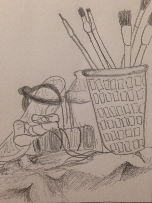
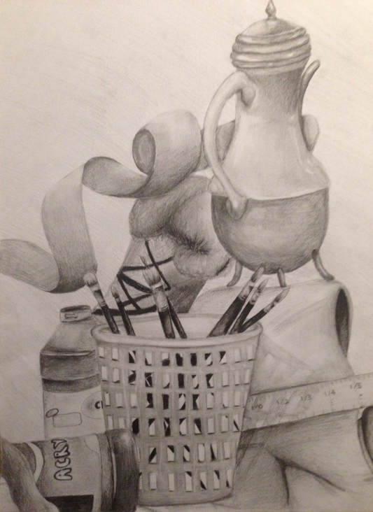
Still Life Final
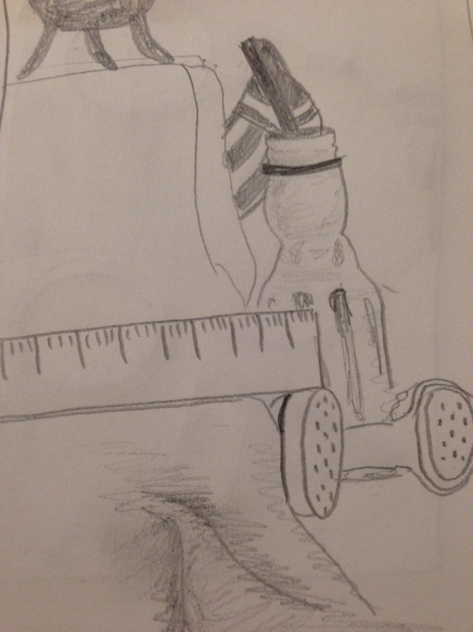
These are my compositional sketches for the still life final, each sketched from a different angle of all the objects laid on the table.
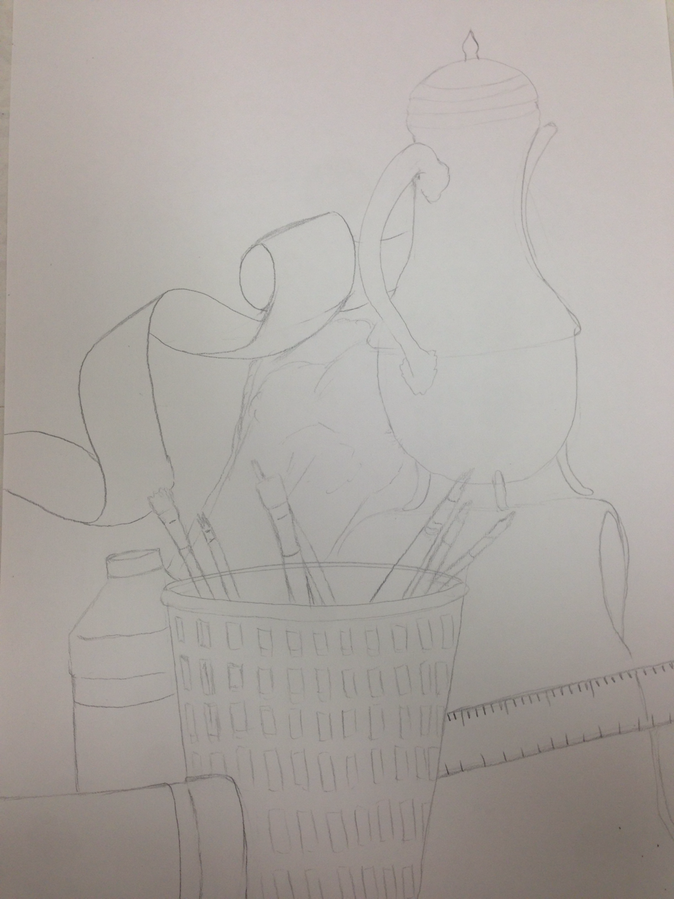
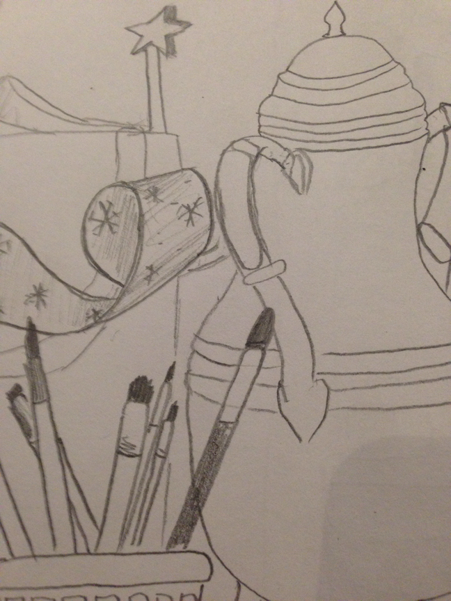
This is the first progress picture for my still life final, just a light sketch and outline so far.
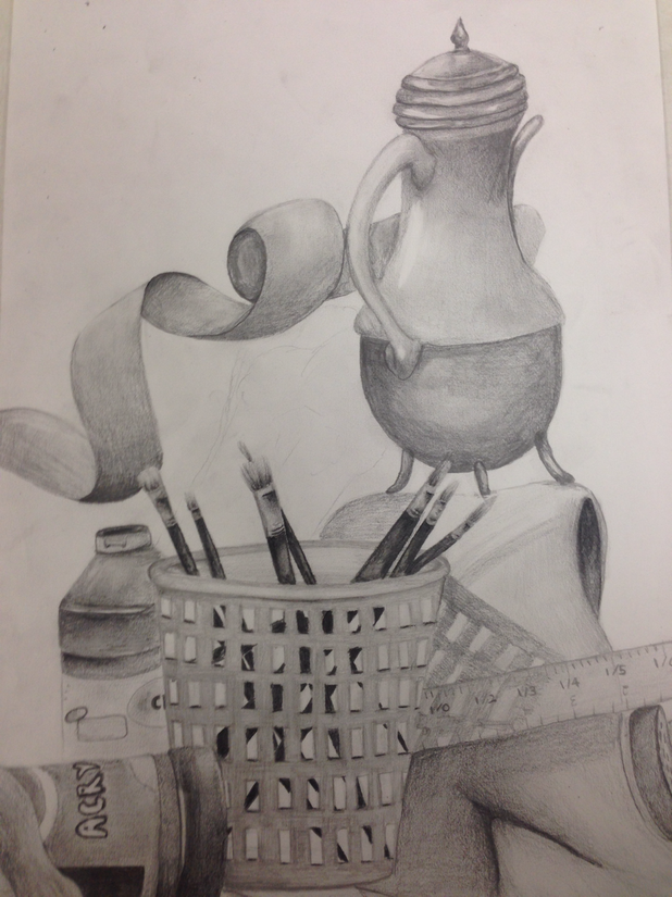
This is my second progress picture for the still life final, I have a good amount of my shading finished.
1)Describe the craftsmanship of your drawing. (Is it clear, clean, blended well, smudges, defined space, etc.)
I believe my drawing came together in the end, with clear edges and definition. However, I think my blending could have been better and if I were to do this again I would shade more carefully.
I believe my drawing came together in the end, with clear edges and definition. However, I think my blending could have been better and if I were to do this again I would shade more carefully.
2)Are your values and shadows realistic? How many values did you include? How and why are values important?
While shading this piece, I did find it necessary to exaggerate my shadows and darker values a bit to have depth and keep contrast. The problem with this is, I lost a lot of my light values, and ended up staying in the middle to darker range of values. Value is very important because it creates the crisp edges between all the different shapes and objects, making the piece more realistic and convincing.
While shading this piece, I did find it necessary to exaggerate my shadows and darker values a bit to have depth and keep contrast. The problem with this is, I lost a lot of my light values, and ended up staying in the middle to darker range of values. Value is very important because it creates the crisp edges between all the different shapes and objects, making the piece more realistic and convincing.
3)Is there a clear source of lighting?
I think so yes, but there are a couple different angles of light hitting the actual set, which can be confusing to draw and I think that came across in my shading at some points.
I think so yes, but there are a couple different angles of light hitting the actual set, which can be confusing to draw and I think that came across in my shading at some points.
4)How important were the compositional sketches? Explain.
Without the compositional sketches, you can get confused about what shapes you want in your drawing, and have more potential to make more mistakes since you are discovering what you are drawing as you're drawing it.
Without the compositional sketches, you can get confused about what shapes you want in your drawing, and have more potential to make more mistakes since you are discovering what you are drawing as you're drawing it.
5)How is your final drawing successful?
I think my use of highlights on the metallic surfaces create a good illusion of a not matte surface. And my brushes in the plastic bin are full of value and I think look very convincing.
I think my use of highlights on the metallic surfaces create a good illusion of a not matte surface. And my brushes in the plastic bin are full of value and I think look very convincing.
6) Are the proportions, structure, and perspective of the subject correct?
I think the relative size of each object was pretty much the same as real life. My snow boot in the background doesn't look very simalar in structure to the real thing. And if I were to do this over, I'd try to shade my ribbon to look more translucent rather than solid and papery as it appears.
I think the relative size of each object was pretty much the same as real life. My snow boot in the background doesn't look very simalar in structure to the real thing. And if I were to do this over, I'd try to shade my ribbon to look more translucent rather than solid and papery as it appears.
7) Does the placement and grouping of objects create a pleasing arrangement (composition)?
Overall yes, but I think it could be a lot better without the snow boot in the back left.
The snow boot has a very simalar range of values as the ribbon and the kettle, making it look busy and messy in the back.
Overall yes, but I think it could be a lot better without the snow boot in the back left.
The snow boot has a very simalar range of values as the ribbon and the kettle, making it look busy and messy in the back.
8)Is there a center of interest and is it well located?
I think this question is asking if there is a particular spot or object in the piece that stands out, and I think the paint brushes in the bin(and the bin) stand out the most. This part is front and center and has a huge contrast from the light shading on the bin to the nearly black brushes, and they pop out a lot.
I think this question is asking if there is a particular spot or object in the piece that stands out, and I think the paint brushes in the bin(and the bin) stand out the most. This part is front and center and has a huge contrast from the light shading on the bin to the nearly black brushes, and they pop out a lot.
9)How well did you manage your time and resources throughout the process of creating this drawing? Do you see where you could improve in this area?
I think I managed my time quite well, I dedicated each day to one or two objects in the piece, and got it done with time to spare. My only worry was that I got it done too quickly, so I think my area of improvement could be slowing down and taking my time.
I think I managed my time quite well, I dedicated each day to one or two objects in the piece, and got it done with time to spare. My only worry was that I got it done too quickly, so I think my area of improvement could be slowing down and taking my time.
10) What challenges did you encounter during this project and how did you overcome them?
My main challenge was getting each object to pop out and not get lost in the "sea of same" values. I asked for help and got advice and got my darker values and highlights to come together. I think I still could have done a lot better in this department, but it's not bad at all.
My main challenge was getting each object to pop out and not get lost in the "sea of same" values. I asked for help and got advice and got my darker values and highlights to come together. I think I still could have done a lot better in this department, but it's not bad at all.
11)What have you learned drawing a still life?
I learned a lot about values and shading. I learned to exaggerate shadows to not only create depth but to also make sure the objects in front or behind it don't meld together. Overall I learned a lot about this project and enjoyed it too:)
I learned a lot about values and shading. I learned to exaggerate shadows to not only create depth but to also make sure the objects in front or behind it don't meld together. Overall I learned a lot about this project and enjoyed it too:)
Prisma Unit
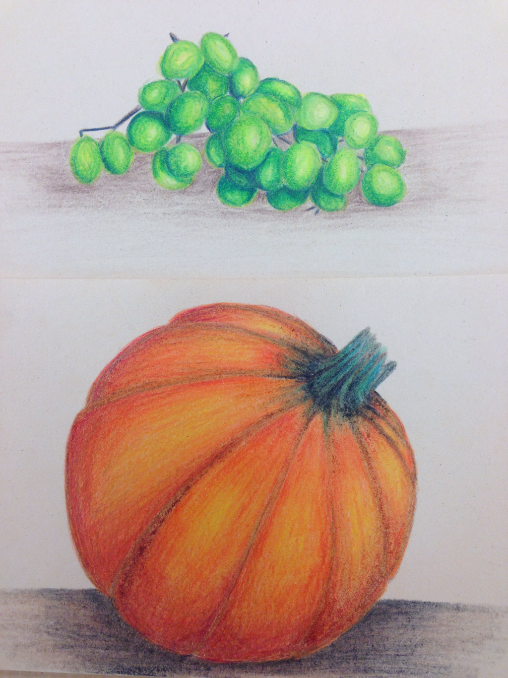
This is my first prismas piece, I did a small bunch of green grapes with cool colors, and a pumpkin with warmer pencils.
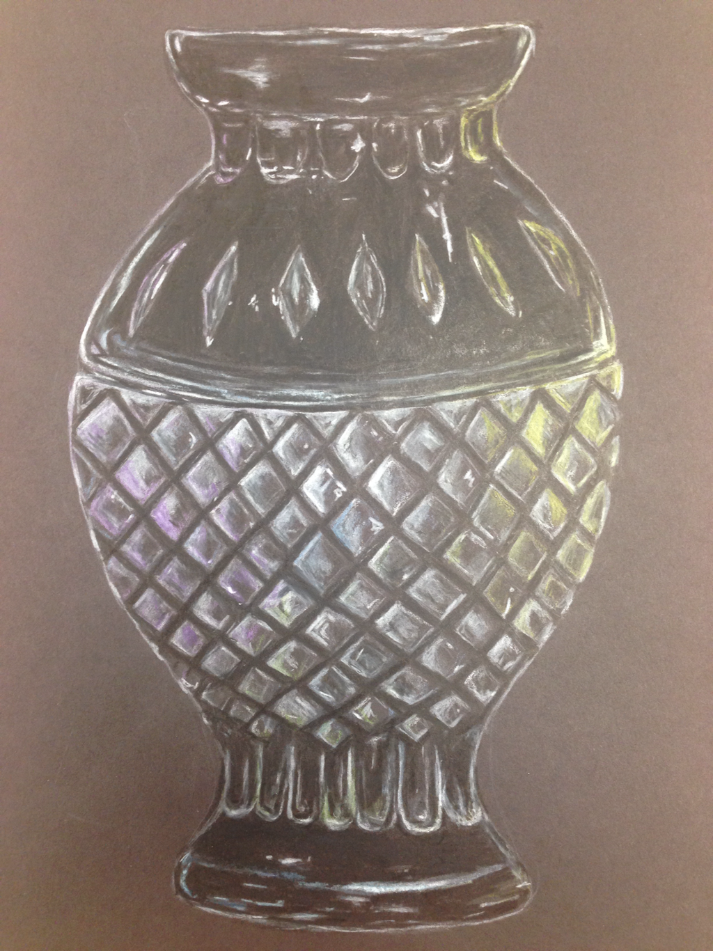
This is my glass piece in prismas, my favorite piece I've done so far this semester.
Foreshortening
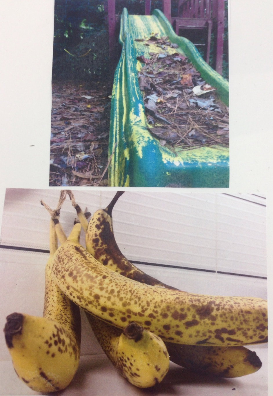
These are some of my reference photos for this project.
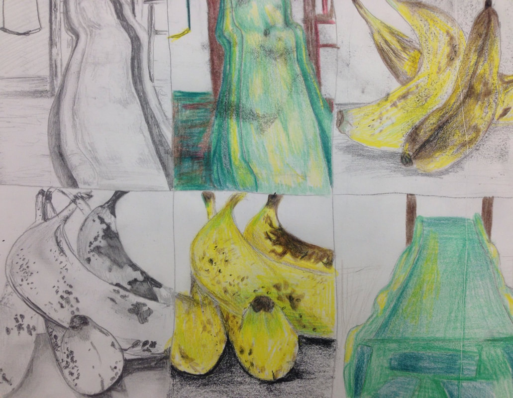
These are 6 of 8 of my compositional sketches for this project, I ended up going with the banana option for this project.
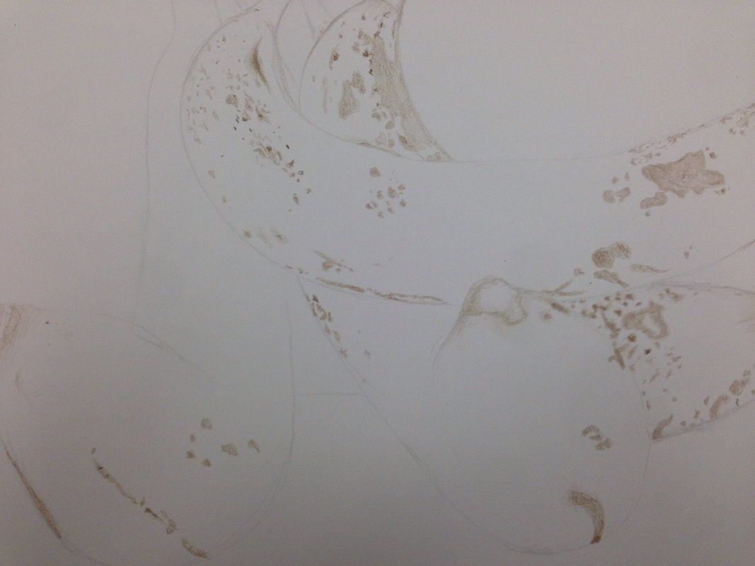
This is my first progress picture for my foreshortening project.
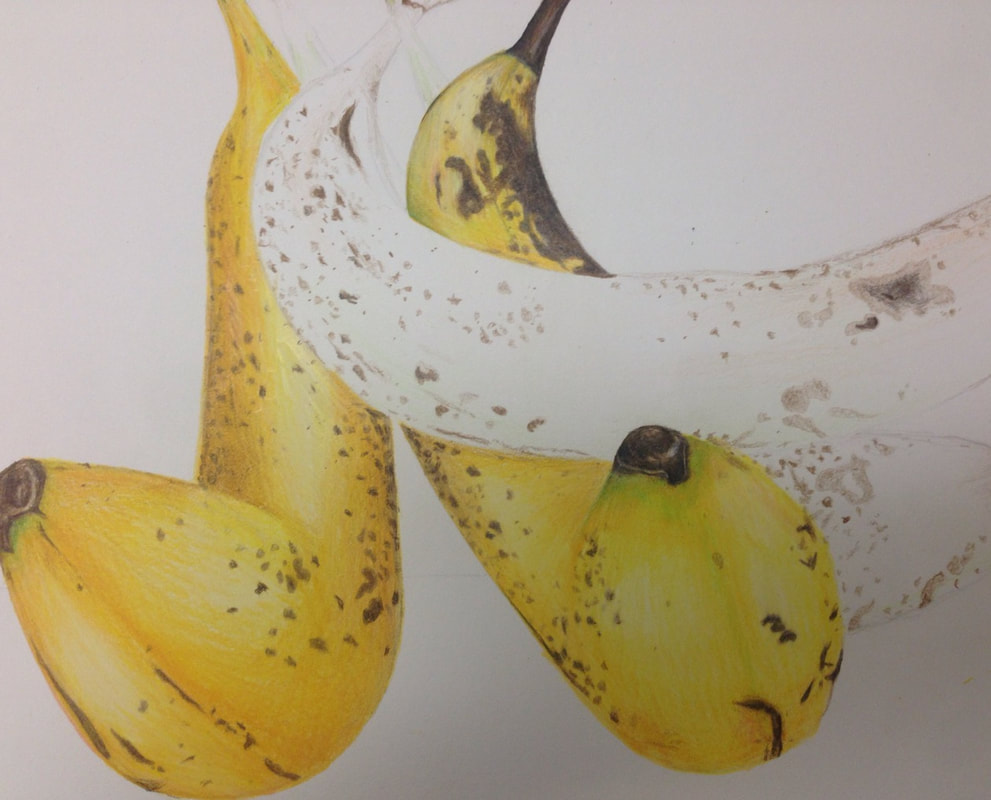
This is my second progress pic for the foreshortening project.
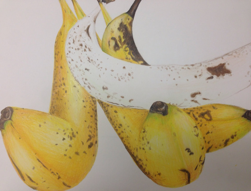
Third progress picture.
1) Describe how you created an interesting point of view? Was it successful? Why or why not?
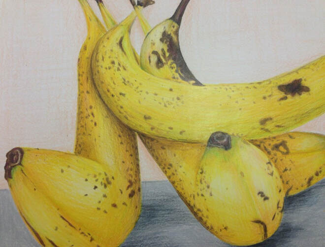
While taking pictures for this project, I pulled the camera below the bananas to get somewhat of an ants perspective. I think when drawing this it was successful because the front of the bananas are shoved closely to the viewer and get smaller towards the back. I think there could be more foreshortening, I'd just have to exaggerate it a bit more.
While taking pictures for this project, I pulled the camera below the bananas to get somewhat of an ants perspective. I think when drawing this it was successful because the front of the bananas are shoved closely to the viewer and get smaller towards the back. I think there could be more foreshortening, I'd just have to exaggerate it a bit more.
2) Why is it important to understand perspective and how to draw it?
The use of perspective trains an artist to pay attention to shapes in their drawings and the angles at which they reside. It is also a great tool for analyzing other things like colors, and learning to exaggerate things in any drawing to emphasize the focal points of the piece.
The use of perspective trains an artist to pay attention to shapes in their drawings and the angles at which they reside. It is also a great tool for analyzing other things like colors, and learning to exaggerate things in any drawing to emphasize the focal points of the piece.
3) How were the colored pencil exercises important in the success of your piece?
Well for my piece, personally, I did a prisma color drawing, so practicing with prismas gave me a better understanding for how to layer the colors and blend the softer pencils. I think this prior practice made it a lot easier for me to do my piece and it turned out how I wanted in terms of brightness in colors.
Well for my piece, personally, I did a prisma color drawing, so practicing with prismas gave me a better understanding for how to layer the colors and blend the softer pencils. I think this prior practice made it a lot easier for me to do my piece and it turned out how I wanted in terms of brightness in colors.
4) Desribe the craftsmanship of your colored pencil. What techniques were used?(How well the project is technically crafted).
In terms of technique I focused a lot on layering light layers to get all the different undertones and values I achieved. I first did the dark spots so that I could blend the yellows, greens, and pinks over them. I also lightly went through the bananas' high points with the peachy and green undertones to get a variety of colors in an otherwise bland range of hues.
In terms of technique I focused a lot on layering light layers to get all the different undertones and values I achieved. I first did the dark spots so that I could blend the yellows, greens, and pinks over them. I also lightly went through the bananas' high points with the peachy and green undertones to get a variety of colors in an otherwise bland range of hues.
5) Were you able to achieve depth by showing a foreground middle ground and back-ground? Explain.
A lot of the depth in my piece was focused in the bananas themselves, and less in the background. I did have some cast shadows on the floor of the picture though to create depth.
A lot of the depth in my piece was focused in the bananas themselves, and less in the background. I did have some cast shadows on the floor of the picture though to create depth.
6)Explain your experience with colored pencil and the project in general. What are the obstacles and advantages?
I really enjoyed this project because of my prior practice with prismas. I was able to understand blending technique and layering to get ge effect I wanted. An obstacle I had was layering shadows after I got a full opacity of color, but I figured it out in the end.
I really enjoyed this project because of my prior practice with prismas. I was able to understand blending technique and layering to get ge effect I wanted. An obstacle I had was layering shadows after I got a full opacity of color, but I figured it out in the end.
7)Looking back on the progression of this project what skills, techniques or other information would you like to have been taught? Do you feel you were prepared for this project?
I think I was prepared for this project. I got to do a small project in prisma earlier, so I understood how to use them. I also had plenty of practice in value changes. I think I could have used some more practice on foreshortening however, I felt like I didn't really know how to apply the techniques we learned to my piece.
I think I was prepared for this project. I got to do a small project in prisma earlier, so I understood how to use them. I also had plenty of practice in value changes. I think I could have used some more practice on foreshortening however, I felt like I didn't really know how to apply the techniques we learned to my piece.
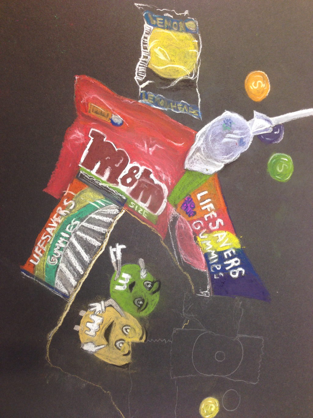
First progress picture of candy chalk drawing.
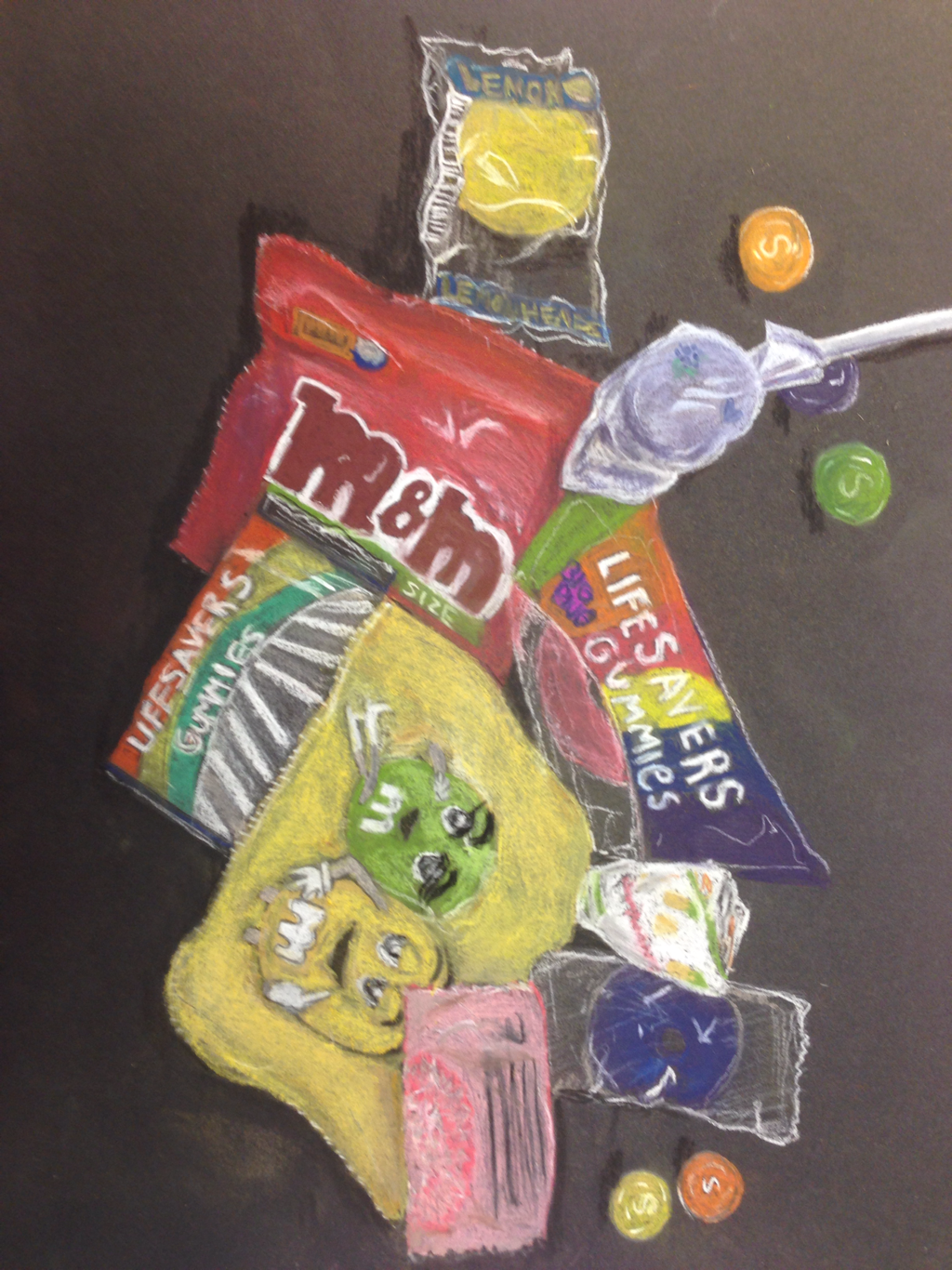
Final candy drawing, I made this piece with prisma chalk and chalk pencils. I used different colors to build up values and shades and blended them together carefully with paper towels and my fingertips.
Opacity Project
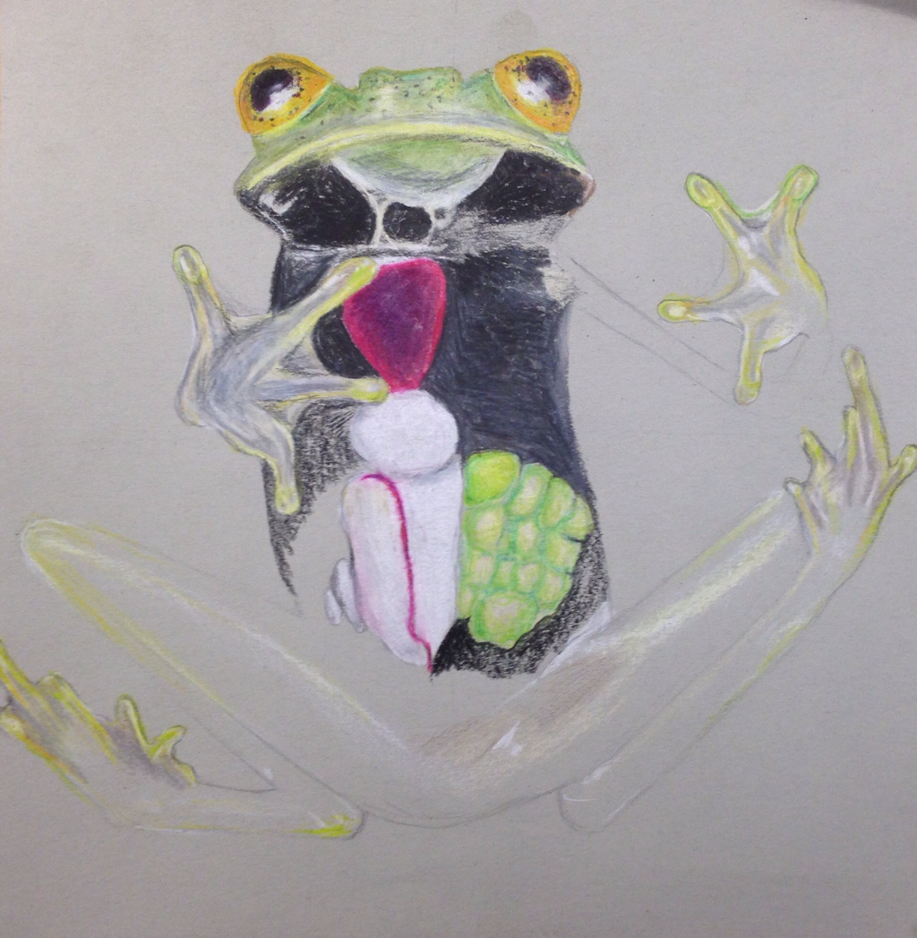
First progress picture.
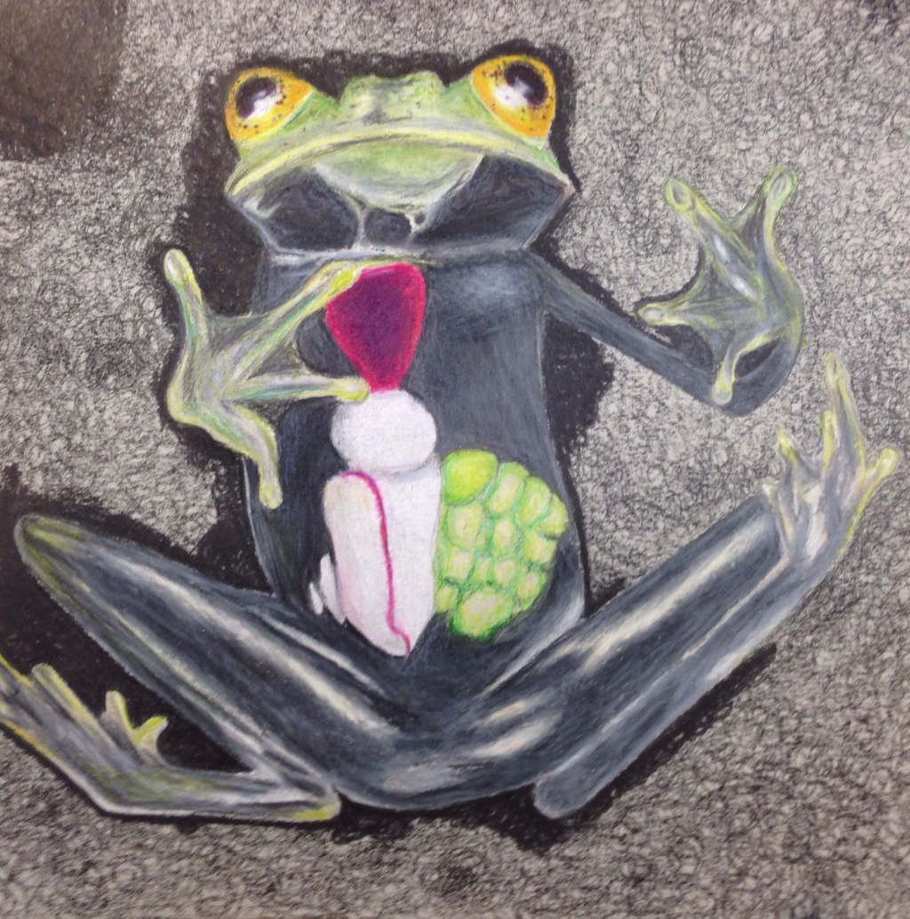
2nd progress picture.
1)Describe the craftsmanship of your drawing.
I think this piece was done well, I had mature simplicity in the piece with the contrasting background and in your face focal point.
I think this piece was done well, I had mature simplicity in the piece with the contrasting background and in your face focal point.
Portrait Project
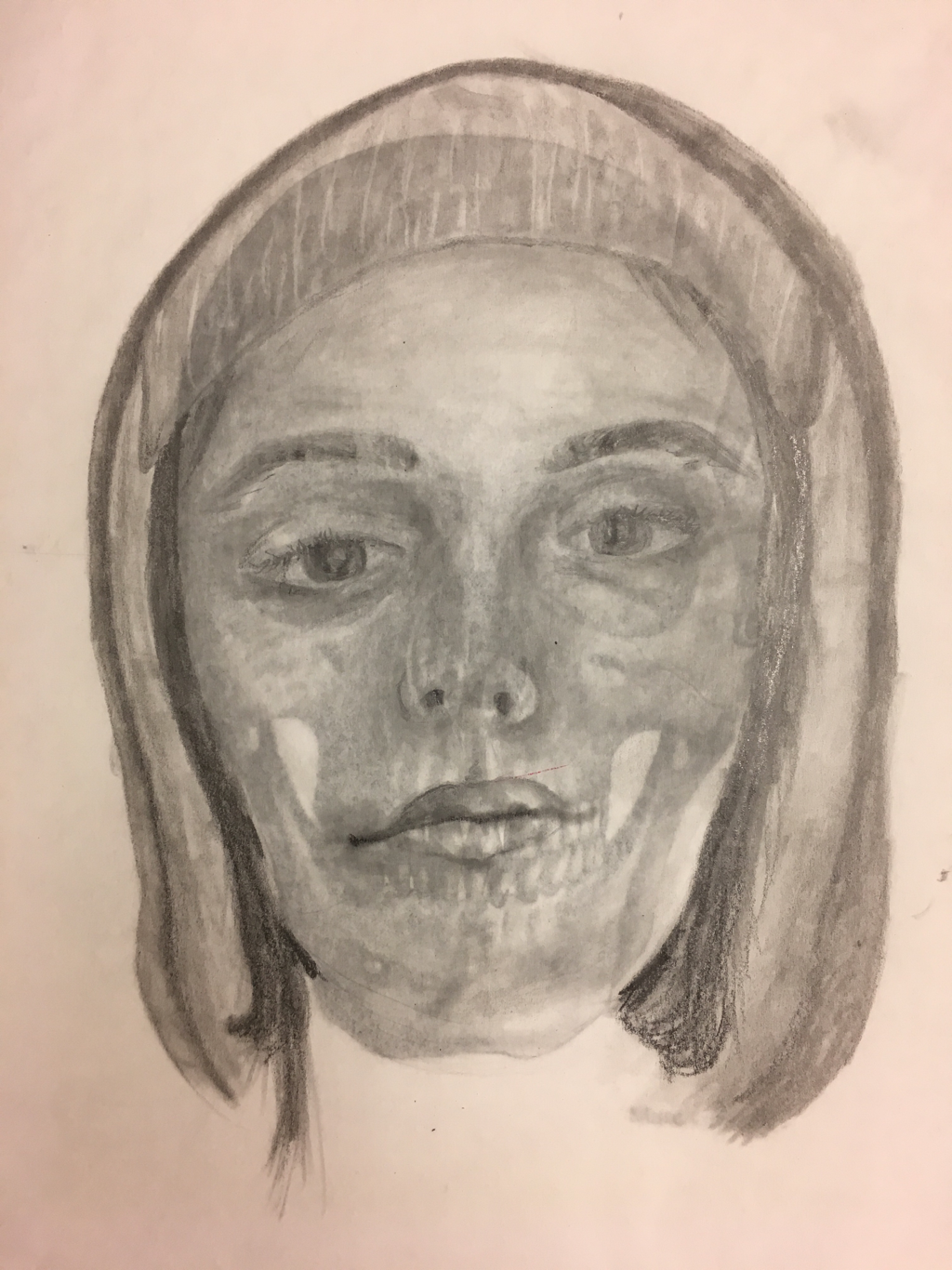
This was a first attempt at a self portrait. We did this by using a skull under our paper to use the basic skull structure as a guide for where our features go. This piece was in my opinion unsuccessful, simply because the portrait didn’t end up looking like me, but I enjoyed the process so I will try again in the future to make this convincing.
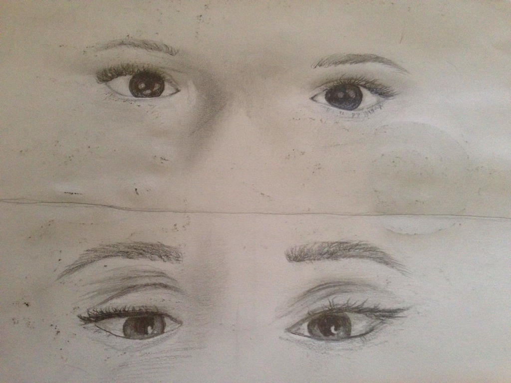
These were our first attempts at drawing both of our eyes.
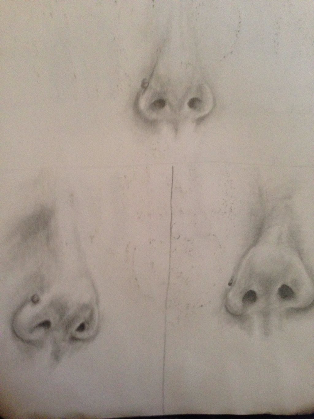
This is three practice sketches of my nose for this project.
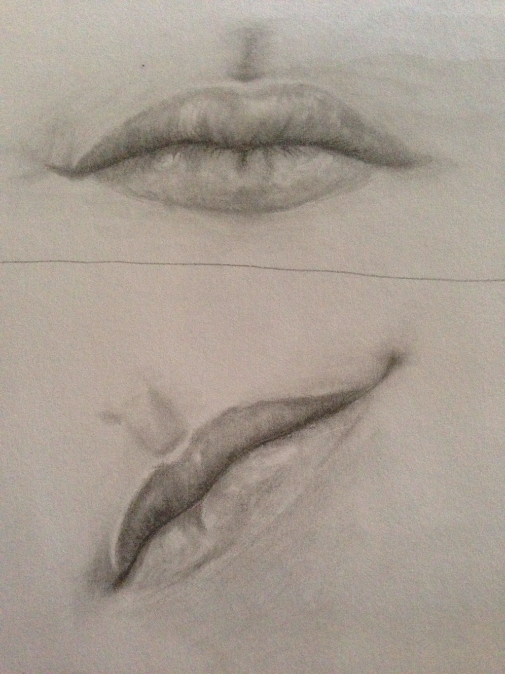
These are a couple of my better sketches of my lips.
Final Portrait
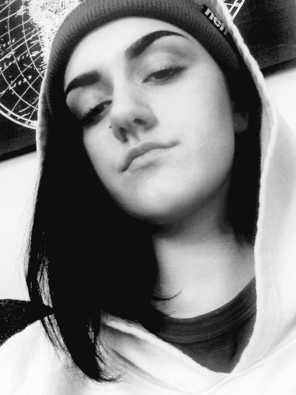
This is the original picture that I drew my portrait from.
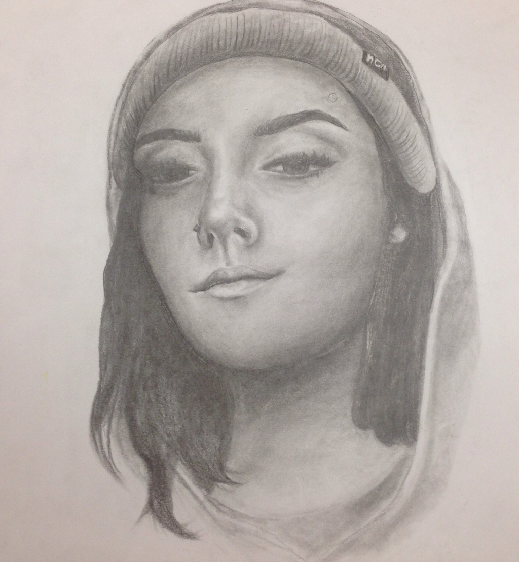
1) Explain the process you went through to develop your drawing.
In the development of this project, we first learned how to draw eyes, then noses and mouths. After learning the pieces, we put them together learning how to make everything proportionate on a generic face. Then, after taking a picture of ourselves, we used these tools to first sketch and then fully shade our self portraits.
In the development of this project, we first learned how to draw eyes, then noses and mouths. After learning the pieces, we put them together learning how to make everything proportionate on a generic face. Then, after taking a picture of ourselves, we used these tools to first sketch and then fully shade our self portraits.
2) Explain how you found the different values in the portrait.
By first establishing the darkest and lightest values in the original picture, I was able to create a visual range of shadows and highlights.
By first establishing the darkest and lightest values in the original picture, I was able to create a visual range of shadows and highlights.
3) Did you achieve a full range of the different values within your portrait? How?
Yes, I think I had a good range of values by looking at the almost black sections like under my hair, in the nostrils, and the pupils of my eye. By slowly building up values throughout I had some parts that I was able to make darker. After this, I went back in with an eraser to get the white highlights, and then blended them out to keep the highlights flush with the rest of the shades.
Yes, I think I had a good range of values by looking at the almost black sections like under my hair, in the nostrils, and the pupils of my eye. By slowly building up values throughout I had some parts that I was able to make darker. After this, I went back in with an eraser to get the white highlights, and then blended them out to keep the highlights flush with the rest of the shades.
4) Describe your craftsmanship. Is the artwork executed and crafted neatly?
Yes, I believe I have neat craftsmanship over all. But in some parts of this drawing I struggled with over penciling the dark spots like my hair, and reached varnishing before I could add highlights.
Yes, I believe I have neat craftsmanship over all. But in some parts of this drawing I struggled with over penciling the dark spots like my hair, and reached varnishing before I could add highlights.
5) How were you able to capture your look?
I used the tools and strategies that we learned earlier and then looked at the shapes and shadows of my picture rather than trying to draw a face.
I used the tools and strategies that we learned earlier and then looked at the shapes and shadows of my picture rather than trying to draw a face.
6) Explain how you made sure you had correct facial feature placement.
I measured my face with my eyes, making everything proportionate and balanced. For example I drew one eye in the center of my face and then drew two more on either side to make sure they were even.
I measured my face with my eyes, making everything proportionate and balanced. For example I drew one eye in the center of my face and then drew two more on either side to make sure they were even.
7) Explain the importance of learning how to draw all the features individually.
If you can't nail the elements of a face, the whole of the face won't look realistic or convincing.
If you can't nail the elements of a face, the whole of the face won't look realistic or convincing.
8) What part of this unit was the most beneficial and why?
Learning how to place all the parts of the face was the most important, I think a lot of people make mistakes not knowing these things. Such as things like how the eyeline is through the center of the face and not through the middle of the forehead. And then also spacing all the features of the face proportionately.
Learning how to place all the parts of the face was the most important, I think a lot of people make mistakes not knowing these things. Such as things like how the eyeline is through the center of the face and not through the middle of the forehead. And then also spacing all the features of the face proportionately.
9) List any obstacles you had to overcome and how you dealt with them.
Issues like getting the shading on both eyes true to the picture were difficult, because the picture itself wasn't straight on, and was at an angle. Also keeping my shadows dark but not varnishing the piece too quickly was difficult.
Issues like getting the shading on both eyes true to the picture were difficult, because the picture itself wasn't straight on, and was at an angle. Also keeping my shadows dark but not varnishing the piece too quickly was difficult.
Scratchboard Project
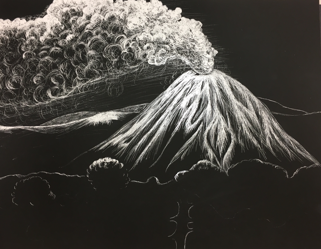
This is the initial sketch for my scratch board project.
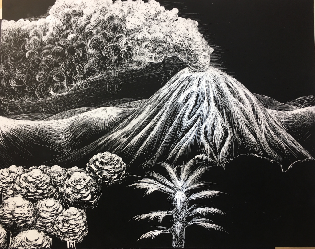
2nd stage of progress.
3rd progress picture.
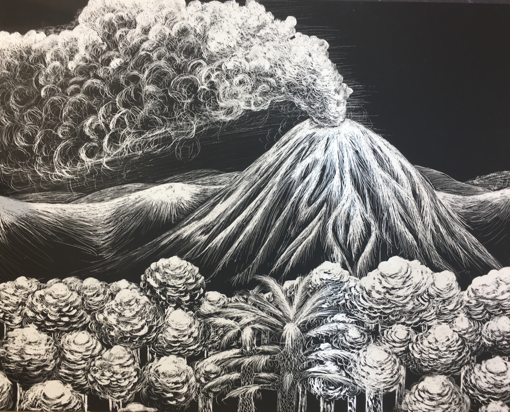
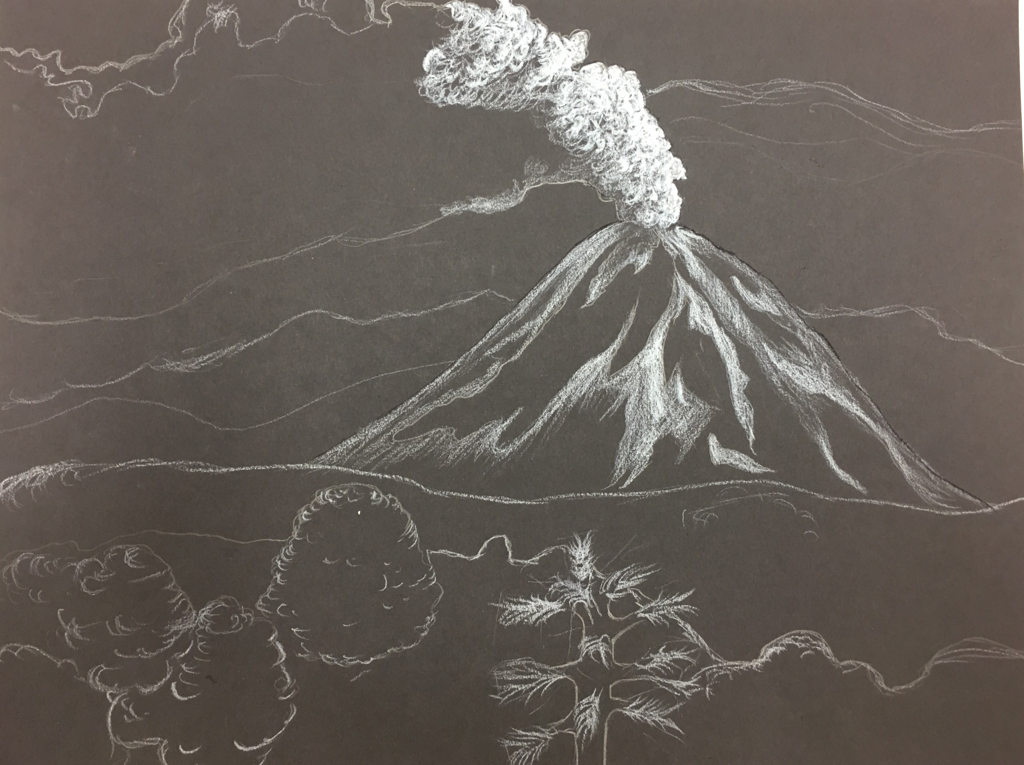
1) Describe the subject matter and meaning of your artwork.
In this piece there are several mountains and a bursting volcano and different trees. The volcano is depicting movement with the smoke billowing out through the piece.
In this piece there are several mountains and a bursting volcano and different trees. The volcano is depicting movement with the smoke billowing out through the piece.
2) How did you use textures to enhance your picture?
In this piece I used different line shapes to create smoke and circular movements to create the leaflike texture on the trees. I also used semi straight lines on the mountains to convey different values on the rock and stone.
In this piece I used different line shapes to create smoke and circular movements to create the leaflike texture on the trees. I also used semi straight lines on the mountains to convey different values on the rock and stone.
3) How did you balance your artwork and create a well-organized composition?
By making a convincing background, middle ground, and foreground, I was able to balance the piece. Creating less focus on the background brought attention to my main focus in this piece, the volcano, balancing the piece. Also creating repetition in the foreground adds focus to the middle ground of this piece.
By making a convincing background, middle ground, and foreground, I was able to balance the piece. Creating less focus on the background brought attention to my main focus in this piece, the volcano, balancing the piece. Also creating repetition in the foreground adds focus to the middle ground of this piece.
4) How did you imply movement in your drawing?
By creating circular movement I created a convincing motion through the smoke from the volcano. I added highlights on the tops of some of the circles to create more movement through the smoke.
By creating circular movement I created a convincing motion through the smoke from the volcano. I added highlights on the tops of some of the circles to create more movement through the smoke.
5) How could you improve your artwork?
I could add diversity through the trees to create more realism. Also to make this piece better, I would shade the volcano differently, making the awkward vertical angles on the face of the volcano more sharp, clear, and concise.
I could add diversity through the trees to create more realism. Also to make this piece better, I would shade the volcano differently, making the awkward vertical angles on the face of the volcano more sharp, clear, and concise.
6) How did you demonstrate a wide range of shading values?
By using little to no scraping movement I created deeper values, and scraping away the scratchboard almost fully got the brightest highlights. Because there is no blending or erasing with this medium, going over the scratchboard over and over to get different values was a really effective strategy for this piece.
By using little to no scraping movement I created deeper values, and scraping away the scratchboard almost fully got the brightest highlights. Because there is no blending or erasing with this medium, going over the scratchboard over and over to get different values was a really effective strategy for this piece.
