Concentration Pieces
My concentration theme is a series of phobias and common fears that I've transformed into something not worth fearing, or something beautiful.
Concentration 1:
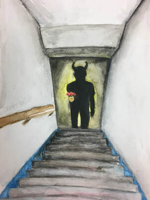
For my first concentration piece, I've put my focus on a common but not popular fear, bathmaphobia. This is the fear of steep stairs, mainly when those stairs lead to something unknown; like a damp scary basement, or a vacant attic space. I exaggerated this idea with a devil representing the unknown at the base of the stairs.
The twist that makes this piece beautiful and non-threatening is that without the shadows masking what we cant see in the piece, there is the implication of an innocent figure, simply trying to gift flowers to the person atop the stairs. I think this piece symbolizes what a lot of fears are about for me, or for other people, the fear of the unknown.
The twist that makes this piece beautiful and non-threatening is that without the shadows masking what we cant see in the piece, there is the implication of an innocent figure, simply trying to gift flowers to the person atop the stairs. I think this piece symbolizes what a lot of fears are about for me, or for other people, the fear of the unknown.
Concentration 2:
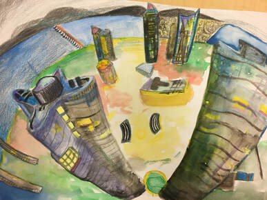
My second fear is the fear of heights or acrophobia. This phobia is the irrational fear of high places, rooted in the fear of falling. This is a more personal piece because this is a fear I actually have, which I share with my dad who also struggles with this fear. This piece is a fish eye view of some of the tallest skyscrapers in the world, which looking at a view like this can set off the fear of heights for any person that deals with this fear severely.
I tried to make this piece something beautiful to look at instead of something frightening, with lots of colors and contrasting textures and shapes. Looking at the reference pictures for this piece made me a bit uncomfortable so I hope this piece doesn't do that for anyone else with this fear.
I tried to make this piece something beautiful to look at instead of something frightening, with lots of colors and contrasting textures and shapes. Looking at the reference pictures for this piece made me a bit uncomfortable so I hope this piece doesn't do that for anyone else with this fear.
Concentration 3:
|
|
|
|
|
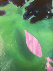
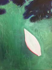
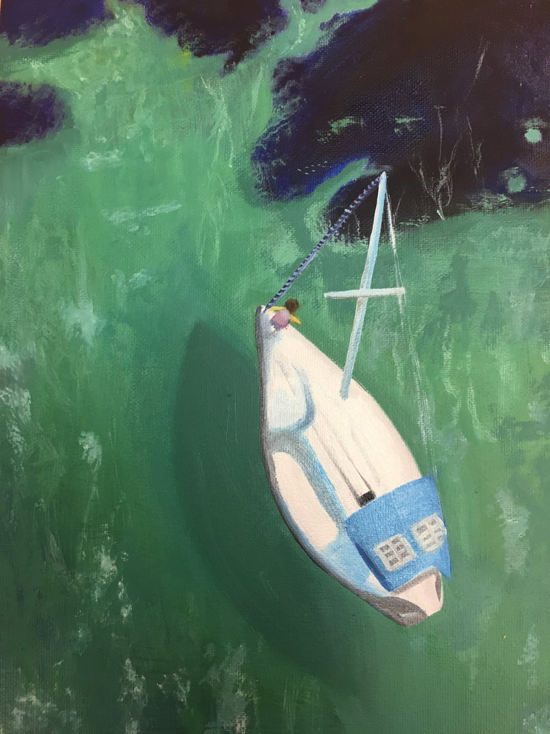
This concentration piece represents the fear of deep water (thalassophobia) as well as the fear of boats or over water traveling technology (naviphobia). This fear often comes from a traumatic experience over the water like a boat sinking, or a childhood experience of nearly drowning in the pool. I have a close friend with this fear so It was important for me to represent it in a less threatening looking way. This fear isn't super common and is often confused with the normal uneasiness people have while on boats for the first time.
To make this imagery more of something beautiful for people with this fear to look at, I added some underwater moss so as to show that it isn't actually bottomless even though it seems really deep. To make it less threatening, I also used a sea green instead of a stark blue, which is often a calming color for a lot of people.
If I were to do this piece again I would really focus on the depth of all the mechanics on the boat, in the reference photo I used there was a lot of sunlight focused on the boat itself, so it was difficult to find good shadows in the boat to paint. I do like however how the water and undersea moss turned out, without context for how this kind of ocean water normally looks this part of the piece might seem a little vague, but I think the dark moss underneath the water looks realistic, and I like how the reflections off the water looked. Another place for improvement I think would be the shadow off the boat and into the water. While painting this shadow, I had a hard time deciding whether I wanted it to be a sharp and crisp lined shadow, or to disperse the shading in the water with a rippling effect. I did both many times in different ways, but I still wasn't able to make it look exactly realistic. I think if I were to do this piece again I would not have gone with the crisper shadow, it ended up looking a little harsh, despite my several attempts to soften it.
Overall I think this piece turned out well, and I think it represents the phobia in a way that makes sense to me, and I'm hopeful that it is a calming, therapeutic piece to look at for people with this fear.
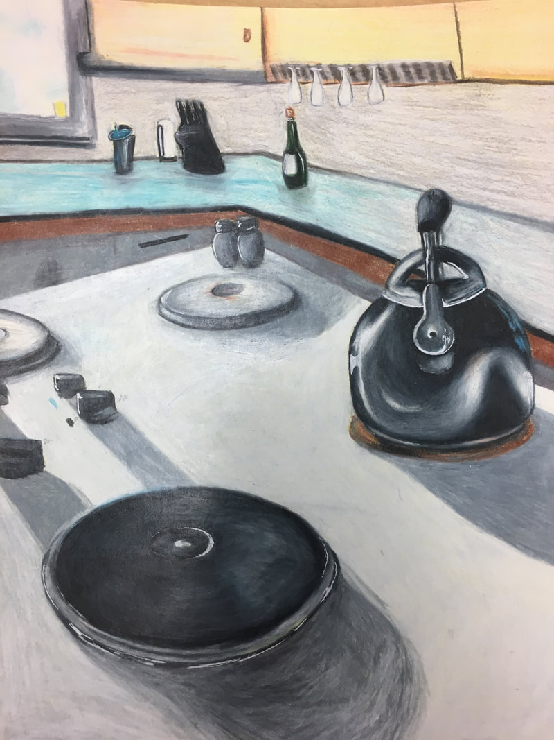
Concentration 4:
|
|
|
|
|
|
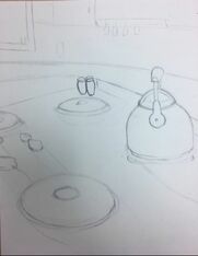
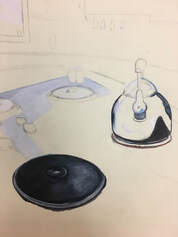
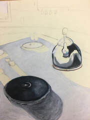
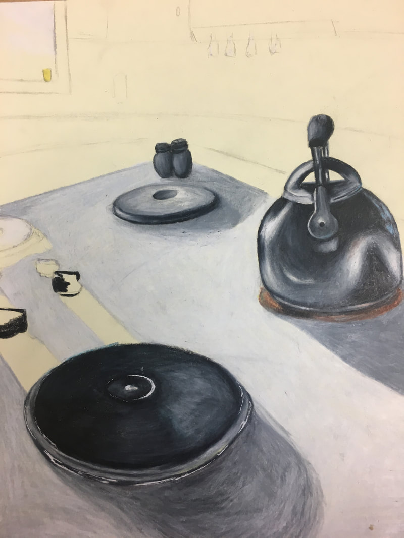
This piece represents the fears that we take with us from childhood into our adult lives, the specific fear depicted is the irrational fear of stovetops. This fear isn't common, but I found it really interesting because its a fear that can be conditioned into someone rather than a fear that you develop through an experience. It comes from being told that they will get burns if they touch it, or that they are dangerous over and over again until they know to avoid it, and can't shake this warience as they grow into adulthood.
I decided when I was brainstorming that I wanted this piece to be something more nostalgic like looking back on photos of your old house or your childhood home. This piece though depicting a fear that isn't specific to me, is something that really resonates with me, because there are a lot of things that I've carried with me into my young adult life.
This concentration is also supposed to be somewhat therapeutic for viewers that resonate with the phobias that are depicted in the pieces. So having a bright color palette, as well as lots of highlights, was important to set the tone of this piece. This phobia is a bit uncommon, so I was worried that this piece wouldn't have the same effect as the other more common ones. But hopefully for the people that suffer from this fear, and other irrational childhood fears, this piece will translate, and be helpful.
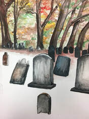
Concentration 5:
|
|
|
|
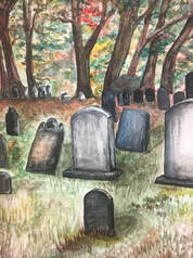
The next concentration is the fear of graveyards, but more specifically death. This phobia is probably one of the most common in our country, a lot of american's hate that they are mortal because they don't think that there is anything to look forward to after death. Another reason people fear death is because they are afraid to leave the people in their lives behind. This piece focuses on the imagery of the graveyard, which is one of the more common forms of physical being releases that our culture practices. (The second most common is cremation. )
To execute this piece I decided to use watercolor pens. I originally planned to use pen and ink over the watercolor to create depth and have a mixed medium effect. Once I finished with the watercolor I decided to leave it alone because I liked the depth I had already been able to create, but I think I will use pen and watercolor paint on my next concentration. I started this piece with gridding the paper and the reference photo that I chose. I made sure that the units of measure were cohesive with the reference pictures, so each inch in the photo represent two inches in the painting. I then painted the dark parts of the background of the piece, by doing the trees and many of the leaves on the trees. I then used a stippling motion with different greens and other warm tones that you might find in nature in the back for more leaves and branches. Then focusing on the foreground I painted the gravestones with black, brown, white, and blue watercolor. After those, I went through with different colors and shapes of grass and fallen leaves to create the floor of a hill, and went back through the whole piece to create the depth and highlights that I thought it might lack.
If I were to do this piece again, I would probably have done less warm colors like red, and yellow in the back on the piece, I painted these with the intention to make the piece more welcoming and beautiful for my concentrations theme, but I ended up overdoing it, and I think that made the piece look messy and overly colorful. I do like, however the shading and cast shadows I was able to create on the grass behind the gravestones, and I think the trees in the back were effective.
Concentration 6:
|
|
|
|
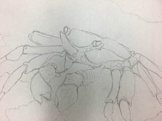
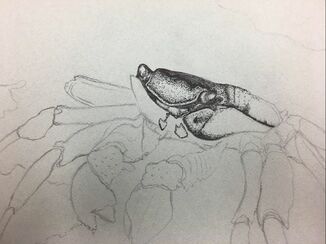
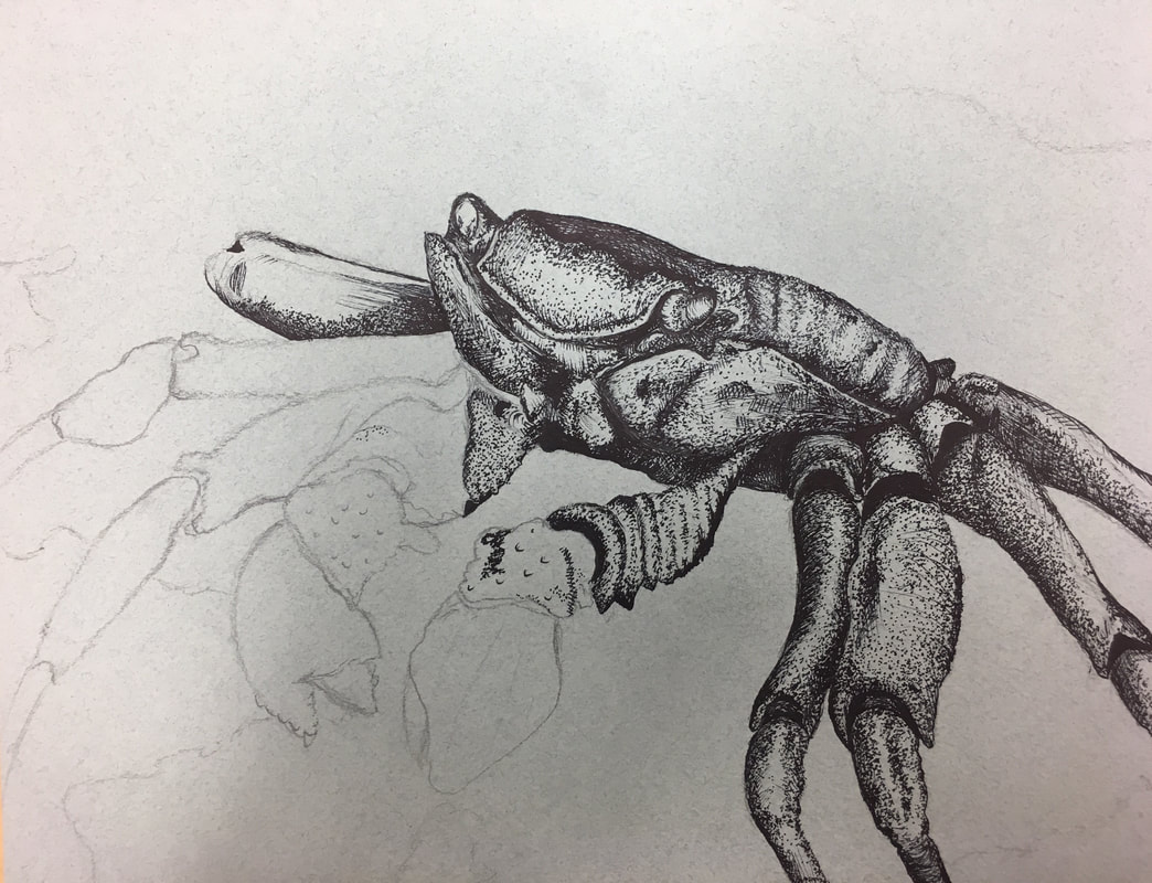
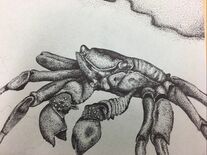
This concentration piece is a more obvious interpretation of my concentration, which I wanted to avoid, but I didn't think my concentration would be complete without one of my fears for the arachnid species. This specific fear is an ocean crab, which has always been frightening for me because of my intense fear of spiders, and crabs to me have always seemed like big spiders.
Creating this piece however, was really fun as pen and ink are my favorite mediums. I had a really hard time coming up with the composition because I didn't want to make it boring, which is what I thought could happen drawing one animal with limited color. I ended up really liking the simple composition with the crab facing the side, and then rocks and a cast shadow in the background. To create this piece I pushed the shadows really heavily and then made the highlights exaggerated so that the legs and claws looked shiny and had multiple dimensions. The pen technique that I used for most of this was stippling, with occasional cross hatching to create different textures.
My favorite part of this piece was how the legs turned out on the right side, I feel like I was able to execute the shading on them well, and I think it ended up being the most realistic portion of the piece. If I had this piece to do over again, I would be more intent with the shading under the crab with the cast shadow, and put more rocks. I stayed away from doing to much shading under the crab because I was worried that the crab might get lost in the background, but I think I could have done more.
Over all this piece was my favorite so far and I think I was able to execute my vision for this piece effectively. I learned a lot about my capabilities in pen and ink and I think I've grown a lot as an artist with this medium.
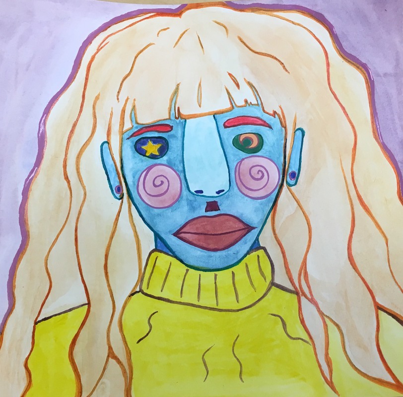
Concentration 8:
|
|
|
|
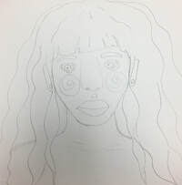
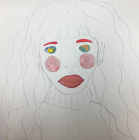
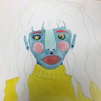
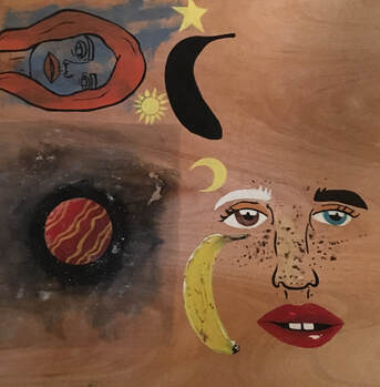
This piece represents my most prominent fear, which is the fear of alienation, which we are subject to due to the way we look. Through the brainstorming process of this piece, I had several issues trying to convey my idea and make this piece feel the way I wanted it to. At first I considered doing lots of different figures, all different ethnicities, with different cultural signals, for example a woman with a Bindi, or a man with a Kippah. I decided however to make this piece for vague, as I thought this might make it more simple and relatable for anyone, when the previous idea might have excluded different cultures.
To craft this piece I started with a set of shapes in a composition and tried to decide how I wanted them to appear together in a unique face. I sketched this piece and then I decided I wanted to make it very colorful so that it didn't represent anything a person has looked like before. I did this piece with watercolor paint, and inks, to make sure that the piece is as colorful as I could get it. In stylizing this piece I made sure to add lines in different places, making the lack of uniformity apparent.
This piece was less about craftsmanship and more about creating a piece that meant something important to me, overall it is my favorite concentration and regards the concentration theme most closely that I tried to achieve.
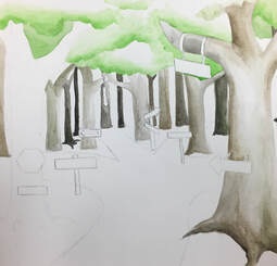
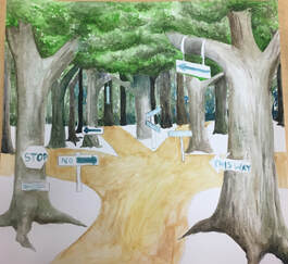
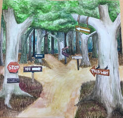
Concentration 9:
|
|
|
|
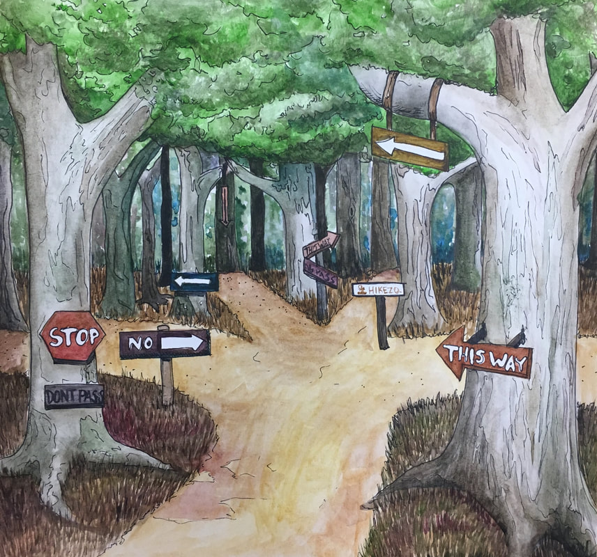
The fear represented in this piece is the fear of getting or being lost. This fear is common in that everyone experiences it in different ways, and in different contexts. This fear manifests in me with the anxieties associated with not finding long term friends, worrying about my family losing their trust in me, etc. To create this piece I made this theme with the signs in a forest, depicting a lot of directions to go. The signs contradict each other, like a sign says no trespassing while another might say go this way pointing at the same path, which communicates that someone traveling through this forest might feel directionless and lost.
To start this piece I put light layers of watercolor to get my colors down, later going in with the texture for depth. After layering lots of watercolor, I put more texture with pen, this took away from the realism of the piece, but It gave it kind of a storybook illustration look which is what I wanted. Color is always important to me in a piece so I made sure to contrast the cool colors in the trees with warm toned signs and tree leaves. Over all I think this piece turned out well, and had a really pretty effect.
To start this piece I put light layers of watercolor to get my colors down, later going in with the texture for depth. After layering lots of watercolor, I put more texture with pen, this took away from the realism of the piece, but It gave it kind of a storybook illustration look which is what I wanted. Color is always important to me in a piece so I made sure to contrast the cool colors in the trees with warm toned signs and tree leaves. Over all I think this piece turned out well, and had a really pretty effect.
Concentration 10:
Concentration 11:
Concentration 12:
Final Reflection
Over the course of this year I've learned so much about creating unique and original art playing off of the creations of other artists and pushing the limits of the mediums available to me. Creating a concentration this last semester has challenged my art process and pushed me to be as creative as I can be. Over all this class has given me the opportunity to evolve my art style, and changed my perspective on what art can be.
When I first started doing art classes I had very little knowledge of any technique or style in creating art, and I had an amateur approach to brainstorming for my next piece. Over the course of over a half dozen art classes I've been able to mature my craft, and I've learned so many valuable techniques such as how to put together a few compositions to get one concise idea for my piece. An example of this new skill is my 9th concentration piece. I did three or four sketches of the piece that I thought might execute the idea that I had, I chose my favorite one, and then was able to create a new idea from that composition. In AP I was able to learn many simple ideas like this one to achieve an over all better in depth process for art. Another amazing part of this class is the prompts, in the lower level art classes I perceived the prompts for projects to be somewhat restrictive for an artist craving artistic liberty, however that structure honed my skills allowing me to create my own ideas with my own choice of medium in my concentration this semester.
If I had a chance to do this class over again, I think I would take a different approach to my thought process for the concentration, I think that I sometimes chose pieces that were too literal, and that created a lack of connection with that piece. Other than that I wouldn't have wanted this class any other way, and I will forever appreciate everything I've learned, and all the opportunities its given me through my life.
